Overview
Multiple constituent plots in plan view can be produced in EnviroInsite with data from EQuIS. Data that can be plotted includes chemical analytical results, water quality parameters, and water elevations. Multiple constituent plots in plan view can be used to simultaneously look at multiple analytes and visualize how their relative concentrations vary spatially. There are several different types of multiple constituent plots in EnviroInsite, which are described in the table below.
Plot Type |
Plot Description |
|---|---|
Pie Charts |
A circular graphic that is divided into slices representing the relative magnitude of items being plotted. Frequently used to depict the spatial distribution or the relative proportion of multiple constituents. |
Radial Diagrams |
A graph where values extend out from a central point, and therefore, demonstrate relationships of constituents. Visual representations of the spatial patterns of contaminants and daughter products. Can be useful in assessing the natural attenuation of decaying contaminants. |
Time Series Graphs |
Georeferenced charts displaying concentrations of multiple constituents over time. Options include multiple axes, trend-lines, and presentation of regulatory standards. |
Bar Charts |
A graph that depicts data with rectangular bars where the length of the bar is proportional to the value. The georeferenced bar charts can be used to display the relative proportion of multiple constituents. |
Merged Data Tables |
Queried data for multiple constituents (and action levels) in a flat table. |
Exercise Scenario
We want to evaluate and compare the spatial distribution for specific chemicals of concern in groundwater: Trichloroethylene, Cis-1,2Dichloroethene and Vinyl Chloride. This will be accomplished by generating several plots on our aerial map so that we may compare the chemicals to each other.
|
Explore the many types of multi-constituent plots to understand the spatial distribution of chemicals of concern. |
|
Exercise Objectives |
•Create Radial Diagrams
•Plot Pie Charts
•Add Georeferenced Time Series Graphs
•Create and Plot Georeferenced Data Tables (Spider Diagrams)
Skills, Software and Permissions Required
•.NET Framework 4.6 or higher must be installed on the workstation
•EnviroInsite 2016 must be installed on the workstation
•Read/write permissions are required for the desired facilities
|
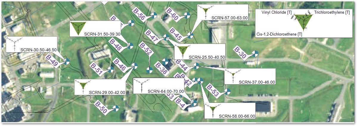
Objective: Create Radial Diagrams |
Create radial diagrams (graphs with more than two axes).
1.If necessary, re-open the saved "insite1.vizx" file from the previous exercise.
2.Un-check the Contour 2 layer in the Plot Control panel.
3.Click Plot> 2D Data> Radial Diagram.
4.In the FormSelectConstituent window, select the desired constituents and then click on the
Arrow (=>) button to transfer the selected items to the Selected box.
For this exercise, select Cis-1,2Dichloroethene, Trichloroethylene, and Vinyl Chloride, where Media Type is WG and the Fraction is T.
|
To select multiple constituents, hold down the CTRL key while clicking on each constituent. |
5.Click the OK button to open the Radial Diagram dialog box.
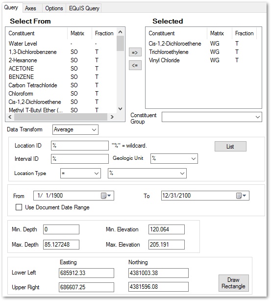
6.On the Query Tab, filter for the desired Location IDs.
For this exercise, enter B-4% in Location ID. This filters the locations so that only those wells with names starting with B-4 are plotted.
7.Select the desired Data Transform, such as Maximum.
8.Select the Axes tab.
9.Select Set Default to reset the values to the selected query parameters.
10.Highlight each constituent by clicking in the box beside the constituent name.
For this exercise, select Trichloroethylene by clicking in the box beside the constituent name and then drag the row up to the top reorder the selected analytes.
11.Set the desired Max. Values and Intervals of each constituent.
For this exercise, set the Max. Value of Trichloroethylene to 6000 and the Interval to 1000.
Set the Max. Value of Cis-1,2-Dichloroethene to 75 and Interval to 15.
Set the Max. Value of Vinyl Chloride to 1400 and Interval to 200.
12.Check Log Scale Axis.
|
The Log Scale Axis option is helpful if the scale of the results vary greatly and a log transformation is desired. |
13.Select the OK button.
14.In the Properties panel, remove the check at Plot Interval ID and click the Apply button.
|
To open the Radial Diagram dialog box to edit an aspect of the posted file, either double left click on any radial diagram or right click on any radial diagram and then select Edit. |
|
Objective: Plot Pie Charts |
1.Un-check the Radial Diagram layer in the Plot Control panel.
2.Select Plot> 2D Data> Pie Chart.
3.On the Query tab, select the desired constituents in the Select From list and then click on the Arrow (=>) button to transfer the selected items to the Selected box.
For this exercise, select Cis-1,2 Dichloroethene, Trichloroethylene, and Vinyl Chloride, each with a Matrix of WG and a Fraction of T.
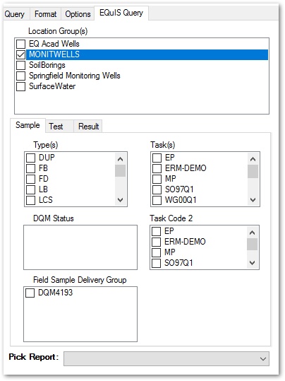
4.Select the EQuIS Query tab.
5.Filter by the desired EQuIS-centric parameters to narrow the queried data.
For this exercise, select the Location Group of MONITWELLS.
6.Select the Options tab.
7.Remove the check at Show Interval ID.
8.Set the Leader to Simple Line.
9.Set the desired Distance, for example, to 20.
10.Select the Format tab.
11.Click on Set Default. This will query the data and return a default set of value – area pairs, where the values at each location are the sum of the measured concentrations. (The actual area will be interpolated between these values).
12.Select the OK button.
13.Rearrange the pie charts on the map to eliminate overlaps, as desired.
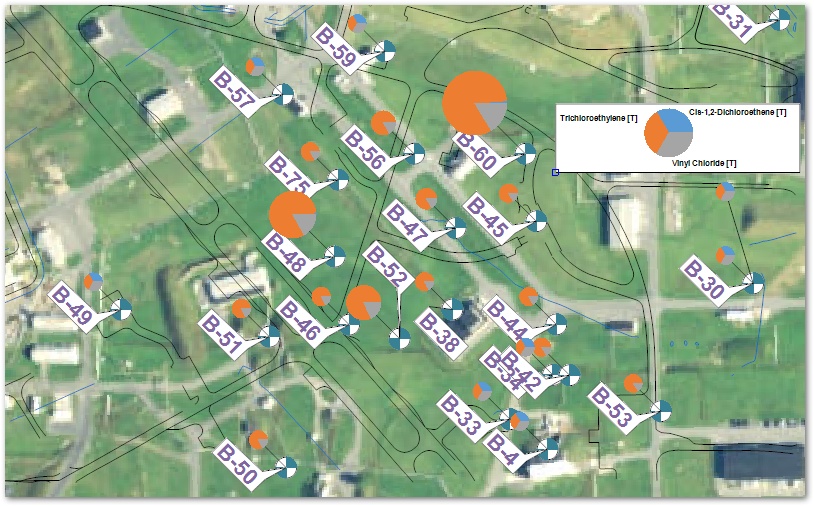
|
To open the Pie Chart dialog box to edit an aspect of the posted file, either double left-click on any pie chart or right-click on any pie chart and then select Edit. |
14.Select View> Tool Tips.
15.Hover the mouse over a pie chart and note that the concentrations show up as Tool Tips. Return to View and un-check Tool Tips to turn the feature off.
|
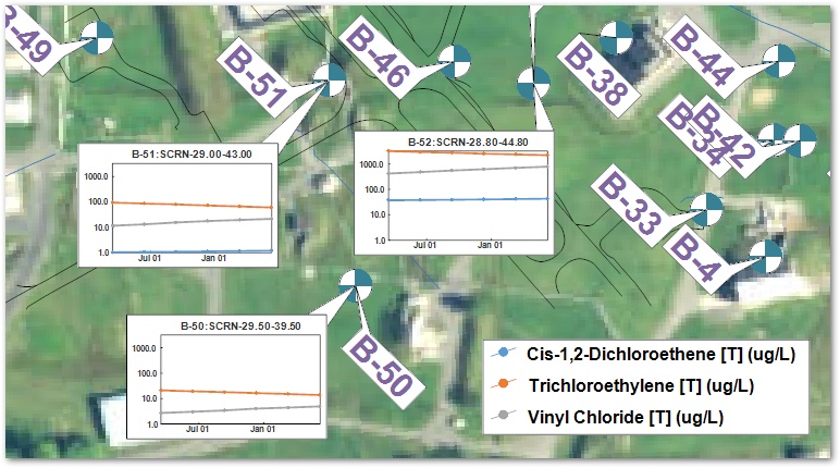
Objective: Add Georeferenced Time Series Graphs |
EnviroInsite can plot "Excel-style" time series graphs as either georeferenced charts tied to a location or tiled charts on a full page. This exercise will only work with the georeferenced charts. Since the data is already in EQuIS and connected to EnviroInsite, it is almost always quicker to plot them in EnviroInsite than it would be to export to Excel to plot.
1.Un-check the Pie Chart layer in the Plot Control panel.
2.Select Plot> 2D Data> Graph.
3.In the FormSelectConstituent window, select the desired constituents and then click on the
Arrow (=>) button to transfer the selected items to the Selected box.
For this exercise, select Trichloroethylene and Vinyl Chloride for a Matrix of WG and Fraction of T.
4.Select the OK button.
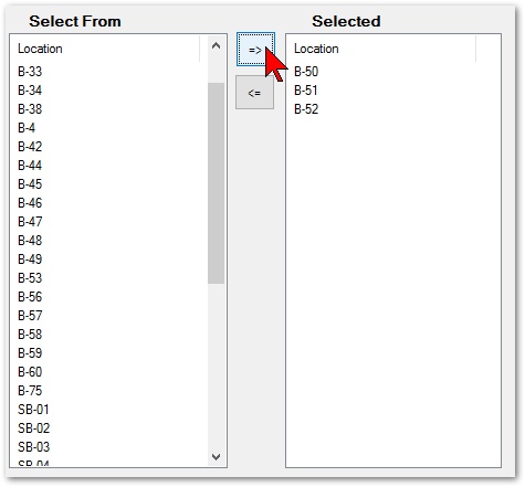
5.Select the List button on the Query tab.
6.Single-click on the Location column header to sort by the location names.
7.While holding down the CTRL key, select the desired locations.
For this exercise, select B-50, B-51 and B-52.
8.Select the Arrow (=>) button to move the locations to the Selected box.
9.Select the OK button.
10.Go to the Time Axis tab and click the Set Default button.
11.Set the Interval to 1/2 year.
12.Set the Date Format to MMM dd.
13.Go to the Left Axis tab and click on the Set Default button.
14.Check Log Scale.
15.Select the Options tab.
16.Check Optimize Locations.
17.Set the desired Distance to 20, for example.
18.Select the OK button.
|
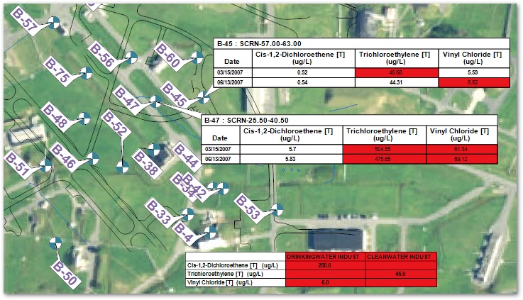
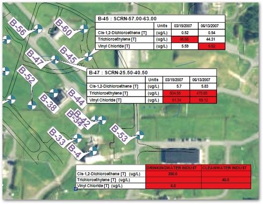
Objective: Create and Plot Georeferenced Data Tables (Spider Diagrams) |
Georeferenced data tables are also known as spider diagrams or chem-boxes. The large set of options makes the georeferenced data table plots a highly flexible way of presenting numerical data.
1.Turn off the Time History layer in the Plot Control panel.
2.Click Plot> 2D Data> Table.
3.On the Query tab, select the desired constituents in the Select From list and then click on the Arrow (=>) button to transfer the selected items to the Selected box.
For this exercise, select Cis-1,2Dichloroethene, Trichloroethylene, and Vinyl Chloride, each with a Media of WG and a Fraction of T.
|
The order that the constituents are listed in the Selected box establishes the order they are presented in the table. Constituents can be reordered by clicking on a constituent and dragging it to the desired place. |
4.Click the List button, and choose the desired locations.
For this exercise, choose B-45 and B-47.
5.Click the Arrow (=>) button to to move the locations to the Selected box.
6.Select the OK button.
7.Set the Date Range as desired.
For this exercise, set the dates as 01/01/2007 to 06/30/2007.
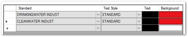
8.Select the Standard tab and select the desired Action Levels.
For this exercise, select the DRINKINGWATER INDUST and CLEANWATER INDUST action levels.
9.Change the Exceedance cell color to Red for any standards. (Change the text color and font also, if desired.)
10.Select the Options tab.
11.Check the Cross-Tab option.
12.Check the Transpose Table option.
13.Click the OK button.
14.Move the plotted Tables around the screen to eliminate overlaps.
15.Find Transpose in the Properties pane and un-check the box.
16.Click on the Apply button.