Overview
The Time Series Chart widget displays report output on a time series chart. The widget can display data from one or more reports and supports automatically grouping data by series, such as parameters or locations. The widget is highly configurable—titles, axes, legends, etc.
When a new Time Series Chart widget is added and configured, the header of the chart displays a range selector that sets the date range based on the data that is included in the underlying report and includes zoom buttons. The Export Menu Button ![]() can be used to download the visible chart as a JPG/JPEG, PNG, or SVG image or download data currently displayed on the chart as a CSV file.
can be used to download the visible chart as a JPG/JPEG, PNG, or SVG image or download data currently displayed on the chart as a CSV file.
Below the header, the chart displays one or more sections. A section consists of a left axis, a right axis, and zero or more data series. Each series within the section is associated with either the left or right axis of that section. The bottom axis displays the date range.
If enabled in the widget properties, the Navigator will appear at the bottom of the chart. Use the Navigator to navigate the date range displayed within the chart. The Navigator shows the entire date range for the chart, with the currently visible date range selected as shown in the scroll bar. Use the bottom scroll bar to scroll through the date range.
If enabled in the widget properties, the Legend will appear in the top-right corner of the chart, next to the first section. Each data series will be listed with its name and color. Click the series name to show or hide that series. For series that are created by grouping report data (i.e., group series by, group sections by), the series group will only display once in the legend, even though that series may appear within multiple sections of the chart.
Exercise Scenario
For the Utah Location Group, we want to compare the Irrigation Water Analytes group (which contains the known GKM contaminants) to the Short-Term and Long-Term Irrigation Waters action levels. We will use a Time Series Chart widget to examine aluminum levels at all sampling locations. The concentrations of arsenic, cadmium, copper, and lead at a single sampling location will be viewed in another Time Series Chart widget.
|
Learn how to create and configure Time Series Chart widgets to view data and compare data series. |
|
Exercise Objectives |
•Add and Configure a Time Series Chart Widget
•Add Additional Data Series to a Time Series Chart Widget
•Make Bulk Edits to Charts
•Make Other Edits to Time Series Chart Widgets
Skills, Software and Permissions Required
•Google Chrome, Mozilla Firefox, or Microsoft Edge
•Editor permissions to desired facilities
•Editor permissions to desired dashboards and reports
•Viewer permissions to the groups and folders object type
•Viewer permissions to all non-administrator widgets
•Creator permissions on the dashboard, EDDs and reports object types
|
Objective: Add and Configure a Time Series Chart Widget |
Once a Time Series Chart widget has been added to the dashboard, data must be added from a report. The widget can then be configured to display the data as desired. In this exercise, data from an Action Level Exceedance report will be displayed as multiple charts for different sampling locations within a single widget.
1.Navigate to any desired dashboard in EQuIS Enterprise.
For this exercise, return to the "Gold King Mine - Utah <your initials>” dashboard.
2.Select More Options ![]() on the right-side of the dashboard header and then select Edit from the drop-down menu to open the Dashboard Editor.
on the right-side of the dashboard header and then select Edit from the drop-down menu to open the Dashboard Editor.
3.Select ![]() to open the Widget Chooser and add a Time Series Chart widget in the desired location on the dashboard. The widget will be displayed on the dashboard in the selected location.
to open the Widget Chooser and add a Time Series Chart widget in the desired location on the dashboard. The widget will be displayed on the dashboard in the selected location.
For this exercise, add a Time Series Chart widget in the Charts section of the dashboard.
4.Select Save to close the Dashboard Editor and save the changes to the dashboard.
5.Select More Options ![]() in the upper right corner of the widget to open the drop-down menu and then select the Edit menu option to open the Widget Editor. The widget title can be modified as well as the color of the widget.
in the upper right corner of the widget to open the drop-down menu and then select the Edit menu option to open the Widget Editor. The widget title can be modified as well as the color of the widget.
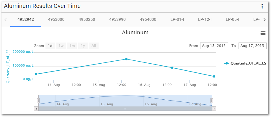
For this exercise, rename the widget to "Aluminum Results Over Time".
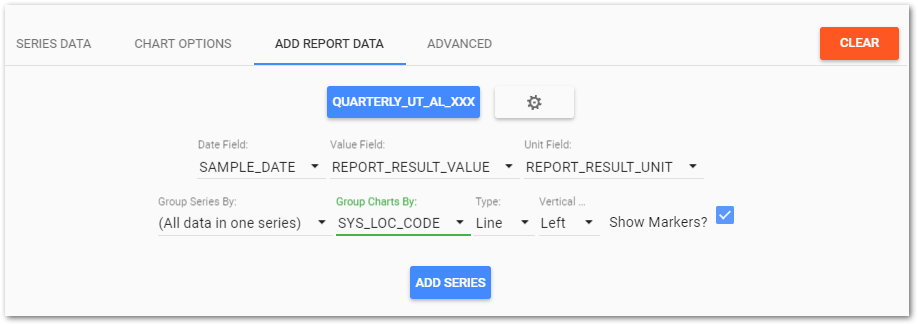
6.Select the Add Report Data tab.
7.Select Choose A Report to open the Report Chooser.
8.From the Report Chooser select the desired report.
For this exercise, select the "QUARTERLY_UT_IRRIGATION <YOUR INITIALS>" report from the previous exercise. A quick way to find this report is to select the Recent folder on the Reports Chooser options menu.
9.Select Edit ![]() to open the Report Parameter Editor for the selected report. The parameters are grouped into nodes and each group can be expanded to show all parameters by clicking on the arrow (
to open the Report Parameter Editor for the selected report. The parameters are grouped into nodes and each group can be expanded to show all parameters by clicking on the arrow (![]() ) to the left of the node. Selected parameter values are listed next to the parameter name. If no value is shown, then no value has been set. To edit the parameter value, click on the drop-down next to the parameter and select the values by highlighting those values.
) to the left of the node. Selected parameter values are listed next to the parameter name. If no value is shown, then no value has been set. To edit the parameter value, click on the drop-down next to the parameter and select the values by highlighting those values.
10.Expand the appropriate nodes to select the desired parameters. If the desired parameter value is not visible from the drop-down list, go to the next page or increase the items per page being displayed.
For this exercise, expand the Analytical Results node. Go to the (Analyte) Group(s) menu item and clear the existing value by deselecting it. Then click on the Individual menu item and select Aluminum. Expand the Action Level node and deselect Long-Term Irrigation Waters.
11.Change the Report Name as desired and select the Save As button to return to the Widget Editor window.
For this exercise, select the Save As button. Once the window opens, change the Report Name to "QUARTERLY_UT_AL_<YOUR INITIALS>”. Select the Save As button to close the window and return to the Widget Editor.
12.In the Date Field, select the desired date field to use for the x-axis.
For this exercise, select SAMPLE_DATE from the Date Field drop-down list.
13.In the Value Field, select the desired field to use for the y-axis.
For this exercise, select REPORT_RESULT_VALUE from the Value Field drop-down list.
14.In the Unit Field, select the desired field to use for the units.
For this exercise, select REPORT_RESULT_UNIT from the Unit Field drop-down list.
15.If desired, select Group Series By to group data from the report into separate series, based on the selected field.
For this exercise, leave the default setting of "All data in one series."
16.If desired, select Group Charts By to group data from the report into separate charts, based on the selected field.
For this exercise, select SYS_LOC_CODE from the Group Charts By drop-down list.
17.Select the desired display Type.
For this exercise, select Line from the Type drop-down list.
18.Set the Vertical Axis to the left or the right.
For this exercise, select Left.
19.To add symbols to the chart, check the Show Markers? box.
For this exercise, check the Show Markers? box.
20.Select the Add Series button. The Series Data tab will be active.
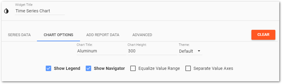
21.Select the Chart Options tab, make changes to the Chart Title and other display options as desired. Note that by default the Legend and Navigator will be displayed.
For this exercise, change the Chart Title to "Aluminum."
22.Select Save ![]() to return to the dashboard. Note the Time Series Chart widget now displays the new data.
to return to the dashboard. Note the Time Series Chart widget now displays the new data.
|
Objective: Add Additional Data Series to a Time Series Chart Widget |
1.Select More Options ![]() in the upper right corner of the widget to open the drop-down menu and then select the Edit menu option to open the Widget Editor.
in the upper right corner of the widget to open the drop-down menu and then select the Edit menu option to open the Widget Editor.
For this exercise, edit the "Aluminum Results over Time" widget configured in the previous exercise.
2.Select the Add Report Data tab.
3.Select Choose a Report to open the Report Chooser.
4.From the Report Chooser select the desired report.
For this exercise, select the "QUARTERLY_UT_AL <YOUR INITIALS>" report from the previous exercise. A quick way to find this report is to select the Recent folder on the Reports Chooser options menu.
5.In the Date Field, select the desired date field to use for the x-axis.
For this exercise, select SAMPLE_DATE from the Date Field drop-down list.
6.In the Value Field, select the desired field to use for the y-axis.
For this exercise, select ACTION_LEVEL from the Value Field drop-down list.
7.In the Unit Field, select the desired field to use for the units.
For this exercise, select ACTION_LEVEL_UNIT from the Unit Field drop-down list.
8.If desired, select Group Series By to group data from the report into separate series, based on the selected field.
For this exercise, select ACTION_LEVEL_CODE from the Group Series By drop-down list
9.If desired, select Group Charts By to group data from the report into separate charts, based on the selected field.
For this exercise, select SYS_LOC_CODE from the Group Charts By drop-down list.
10.Select the desired display Type.
For this exercise, select Line from the Type drop-down list.
11.Set the Vertical Axis to the left or the right.
For this exercise, select Left.
12.To add symbols to the chart, check the Show Markers? box.
For this exercise, uncheck the Show Markers? box.
13.Select the Add Series button. The Series Data tab will be active.
|
Objective: Make Bulk Edits to Charts |
The Series Data tab has a bulk editing feature, which can be used to set values for all series.
1.Select the Series Data tab.
2.Click Show Bulk Edit Options to display a table with available bulk editing options.
3.Check the Min box and then define a minimum value for all series, if desired.
For this exercise, set the Min value to 0.
4.Check the Max box and define a maximum value for all series, if desired.
For this exercise, set the Max value to 140,000.
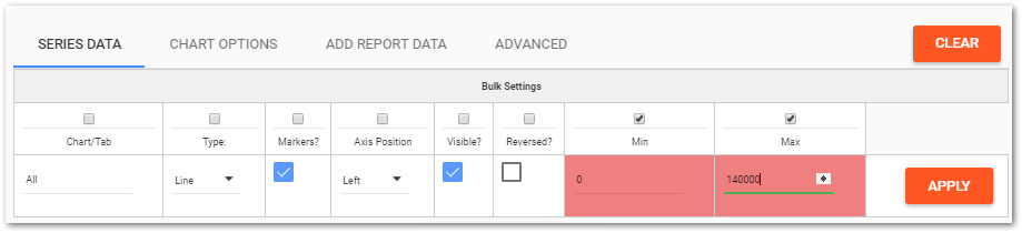
5.Select Apply and then OK on the message dialog box.
6.Click Hide Bulk Edit Options.
|
Objective: Make Other Edits to Time Series Chart Widgets |
The Series Data tab allows the user to view/edit the properties for any chart series added to the widget. Each series is displayed in the Series Data grid. If the number of series exceeds the selected rows per page limit, multiple pages will be available. If the series are grouped by chart, each chart and the associated series are displayed on a separate page. The paging controls are at the bottom of the widget.
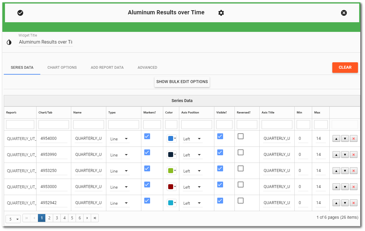
1.Set the Rows per Page to be able to easily view the data series.
2.Scroll up and down to view all series and charts.
3.Modify series' properties as desired.
For this exercise, uncheck the Axis Visible? option for the Short-term Irrigation Action Level series.
4.Select Save ![]() to return to the dashboard and view the updated widget.
to return to the dashboard and view the updated widget.
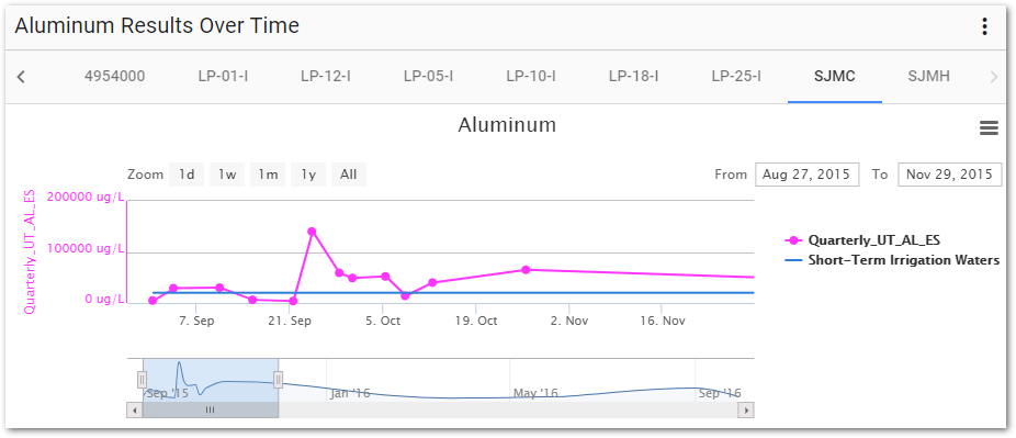
5.Review the look of the charts on the widget and make modifications as desired.
For this exercise, select different sampling locations to view the various charts. Select the SJMC chart and drag the navigator scroll bar to see how the chart changes as the date range is adjusted.
|
Hovering the mouse over the chart series will display a tooltip. The top line of the tooltip contains the date/time value at the current point. Following the date/time value, each series will be listed with the value and unit. |