Overview
The Scatter Plot widget plots two different chemicals or parameters on the X- and Y- axis to demonstrate correlations. The input data needed to product the chart is a set of value pairs saved in a user report.
Exercise Scenario
For the Utah Location Group, we want to examine the possible correlation of temperature and pH in the San Juan River.
|
Learn how to create and configure Scatter Plot widgets to compare two field parameters or analytes. |
|
Exercise Objectives |
•Add and Configure a Scatter Plot Widget
Skills, Software and Permissions Required
•Google Chrome, Mozilla Firefox, or Microsoft Edge
•Editor permissions to desired facilities
•Editor permissions to desired dashboards and reports
•Viewer permissions to the groups and folders object type
•Viewer permissions to all non-administrator widgets
•Creator permissions on the dashboard, EDDs and reports object types
|
Objective: Add and Configure a Scatter Plot Widget |
Once a Scatter Plot widget has been added to a dashboard, various properties can be configured. In this exercise, the configuration options will be explored.
1.Navigate to any desired dashboard in EQuIS Enterprise.
For this exercise, return to the "Gold King Mine - Utah <your initials>” dashboard.
2.Select More Options ![]() on the right-side of the dashboard header and then select Edit from the drop-down menu to open the Dashboard Editor.
on the right-side of the dashboard header and then select Edit from the drop-down menu to open the Dashboard Editor.
3.Select ![]() to open the Widget Chooser and add a Scatter Plot widget in the desired location on the dashboard. The widget will be displayed on the dashboard in the selected location.
to open the Widget Chooser and add a Scatter Plot widget in the desired location on the dashboard. The widget will be displayed on the dashboard in the selected location.
For this exercise, add a Scatter Plot widget in the Charts section of the dashboard.
4.Select Save to close the Dashboard Editor and save the changes to the dashboard.
5.Select More Options ![]() in the upper right corner of the widget to open the drop-down menu and then select the Edit menu option to open the Widget Editor. The widget title can be modified as well as the color of the widget.
in the upper right corner of the widget to open the drop-down menu and then select the Edit menu option to open the Widget Editor. The widget title can be modified as well as the color of the widget.
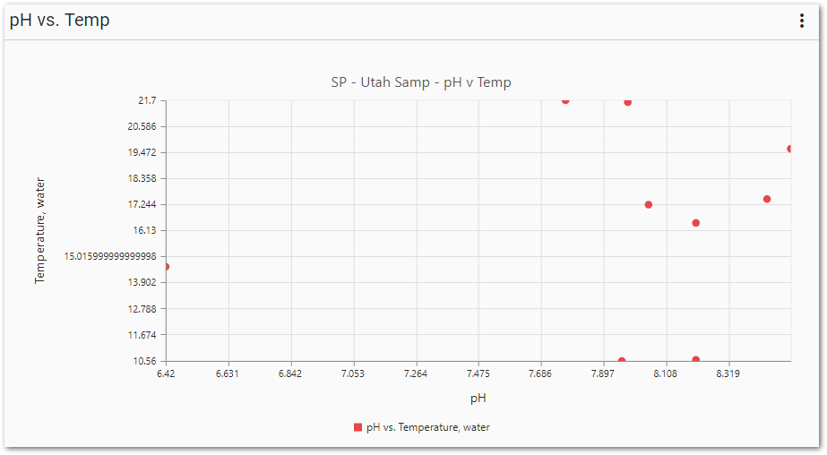
For this exercise, rename the widget to "pH vs. Temp".
6.Select Choose a Report to open the Report Chooser.
7.From the Report Chooser select the desired report that contains a single pair of analytes for comparison.
For this exercise, select the SP – UTAH SAMP – PH V TEMP report.
8.For the X-Axis, choose the desired value.
For this exercise, select pH.
9.For the Y-Axis, choose the desired value.
For this exercise, select Temperature, water.
10.Select Save ![]() to exit the Widget Editor and view the scatter plot.
to exit the Widget Editor and view the scatter plot.