Overview
In EQuIS Enterprise, the Map Widget works with Esri's ArcGIS JavaScript API to display a multi-layered map with facility locations (as defined in VW_LOCATION), report output, and other map layers. Available map layer types include:
•User Report – An existing or new EQuIS report.
•Feature Layer – An Esri Feature Layer, defined by a URL.
•ArcGIS Server Dynamic Map Service Layer – An ArcGIS Server Dynamic layer, defined by a URL.
•ArcGIS Tiled Layer – A tiled image layer, defined by a URL. It is possible to set a custom level of detail for Tiled Layers by checking the "Custom Level of Detail" check box.
•GeoRSS Layer – GeoRSS is a live web feed that includes geographic features and locations. For example, a transportation department might maintain a GeoRSS of current vehicle accidents in their local area.
•KML Layer – An Esri KML layer, defined by URL. The URL must be accessible by Esri (not Intranet or firewalled location).
•WMS Layer – A Web Map Service (WMS) is a standard protocol for serving (over the Internet) georeferenced map images, which a map server generates using data from a GIS database. This is not as well supported by Esri as other layer types, and some features available in other GIS systems may not be available.
•Image Layer – An Esri Image Service layer.
•Vector Tile Layer – An Esri Vector tile layer. The URL can either be the layer URL or style json URL.
Popups can be defined to display when a user selects a location on the map. The Popup Window can display data, images, charts, crosstabs, and other information. Image files (e.g., PNG, JPG, GIF) associated with a location will display as a thumbnail in the Map Widget Popup Window. Image files can be associated to a location and uploaded via the Explorer widget.
The Map widget interacts with other widgets and filters. When a location is selected or hovered over, the Map widget signals other widgets. The Map widget also allows the EZView widget to add a report layer onto the map. This report will appear until the Map widget is refreshed.
A variety of map types are available within Enterprise. The Basemap Gallery ![]() in the top-right corner displays a drop-down selection of map types. The current options are ArcGIS defaults types.
in the top-right corner displays a drop-down selection of map types. The current options are ArcGIS defaults types.
The Layer List ![]() in the bottom-left corner displays a list of layers and sub-layers added to the map. Layers can be toggled on and off by selecting the View
in the bottom-left corner displays a list of layers and sub-layers added to the map. Layers can be toggled on and off by selecting the View ![]() icon for the layer. When a layer is added to the map, Expand Legend
icon for the layer. When a layer is added to the map, Expand Legend ![]() in the bottom-right corner can be selected to view a drop-down list of map symbols.
in the bottom-right corner can be selected to view a drop-down list of map symbols.
Although the default view extents for the map can be set, the user can always change how much of the map is displayed. Zoom In or Zoom Out buttons are located on the top-left corner of the widget. Users can also zoom in and out by using the scroll button on the mouse. The Enter Fullscreen ![]() button expands the map to the extent of the user's screen.
button expands the map to the extent of the user's screen.
Exercise Scenario
For the Utah Location Group, we want to examine the spatial distribution of all sampling locations. After reviewing the time series data, we want to examine the spatial distribution of the elevated aluminum levels during the initial days of sampling.
|
Learn how to create and configure Map widgets to view data spatially. Understand how to set the extents of the Map widget and zoom in, zoom out, and pan to view data displayed. |
|
Exercise Objectives |
•Display Locations from a Location Group on a Map Widget
•Add Report Layers to a Map using the Map Widget
Skills, Software and Permissions Required
•Google Chrome, Mozilla Firefox, or Microsoft Edge
•Editor permissions to desired facilities
•Editor permissions to desired dashboards and reports
•Viewer permissions to the groups and folders object type
•Viewer permissions to all non-administrator widgets
•Creator permissions on the dashboard, EDDs and reports object types
|
Objective: Display Locations from a Location Group on a Map Widget |
Once a Map widget has been added to a dashboard, various properties can be configured. The Map widget editor window contains tabs for general options, map layers, labels, symbology for posted data, and map extents. In this exercise, the configuration options will be explored.
1.Navigate to any desired dashboard in EQuIS Enterprise.
For this exercise, return to the "Gold King Mine - Utah <your initials>” dashboard.
2.Select More Options ![]() on the right-side of the dashboard header and then select Edit from the drop-down menu to open the Dashboard Editor.
on the right-side of the dashboard header and then select Edit from the drop-down menu to open the Dashboard Editor.
3.Select ![]() to open the Widget Chooser and add a Map widget in the desired location on the dashboard.
to open the Widget Chooser and add a Map widget in the desired location on the dashboard.
For this exercise, add a Map widget in the Map section on the dashboard.
4.Select Save to close the Dashboard Editor and save the changes to the dashboard.
5.Select More Options ![]() in the upper right corner of the widget to open the drop-down menu and then select the Edit menu option to open the Widget Editor. The widget title can be modified as well as the color of the widget.
in the upper right corner of the widget to open the drop-down menu and then select the Edit menu option to open the Widget Editor. The widget title can be modified as well as the color of the widget.
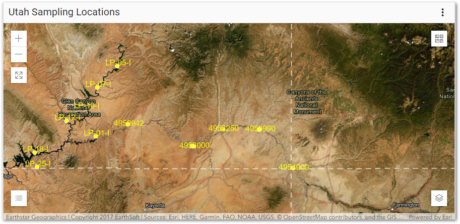
For this exercise, rename the widget to "Utah Sampling Locations."
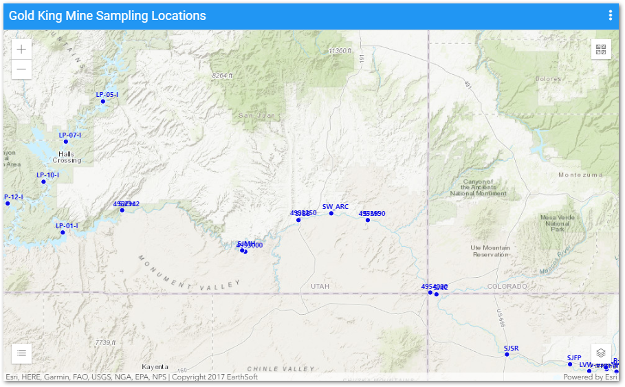
6.On the General tab, check the Show Facility Layer box. Click Choose Facility to open the Facility Chooser and then select the desired facility.
For this exercise, expand the North America folder and then select the Gold King Mine facility.
7.Select the desired Location Group from the drop-down menu.
For this exercise, select Utah from the Location Group drop-down menu.
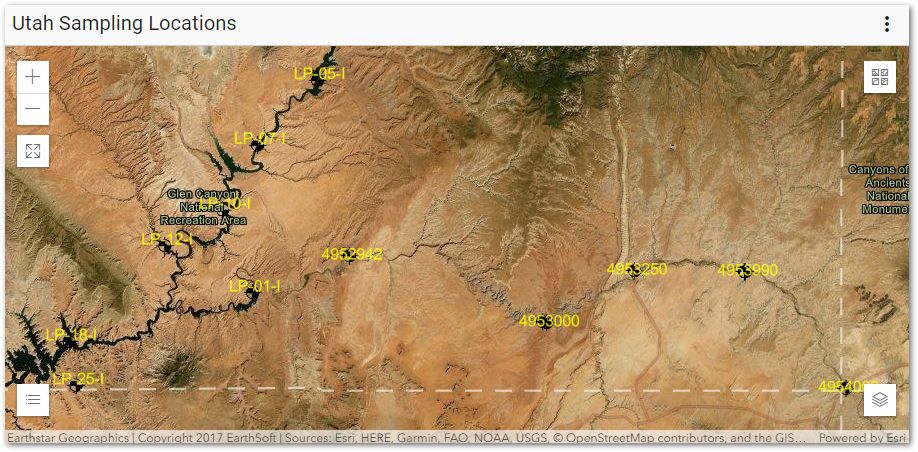
8.Select the Labels tab. Properties on this tab control how the selected Location Group points will appear on the selected basemap.
9.Check Show Location Labels.
10.Select the desired Label Column (i.e., EQuIS database field name).
For this exercise, set the Label Column to code (short for SYS_LOC_CODE).
11.Set the Label Color and Font Size as desired. These settings (in addition to the Label Column) are required to ensure the location labels are visible.
For this exercise, set the Utah Location Group labels as follows:
•Label Color to Yellow (#FFFF00).
•Font Size to "12."
12.Set other properties as desired. The label preview shows how the label font family and weight will display.
•Font Family to Segoe UI.
•Font Weight to Bolder.
13.Select Save ![]() to exit the Widget Editor and return to the map.
to exit the Widget Editor and return to the map.
14.Select the desired basemap from the Basemap Gallery ![]() in the top-right corner of the map widget and then select
in the top-right corner of the map widget and then select ![]() to collapse the basemap tool.
to collapse the basemap tool.
For this exercise, select the Imagery Hybrid basemap. The map will display zoomed to the application extents, which is the western continental United States. The surface water sampling locations are displayed on the map with a black symbol and yellow labels, but cannot be read without zooming into the site. Select Zoom In from the top-left corner of the Map widget to better view the sampling locations
14.Select More Options ![]() in the upper right corner of the widget to open the drop-down menu and then select the Edit menu option to open the Widget Editor.
in the upper right corner of the widget to open the drop-down menu and then select the Edit menu option to open the Widget Editor.
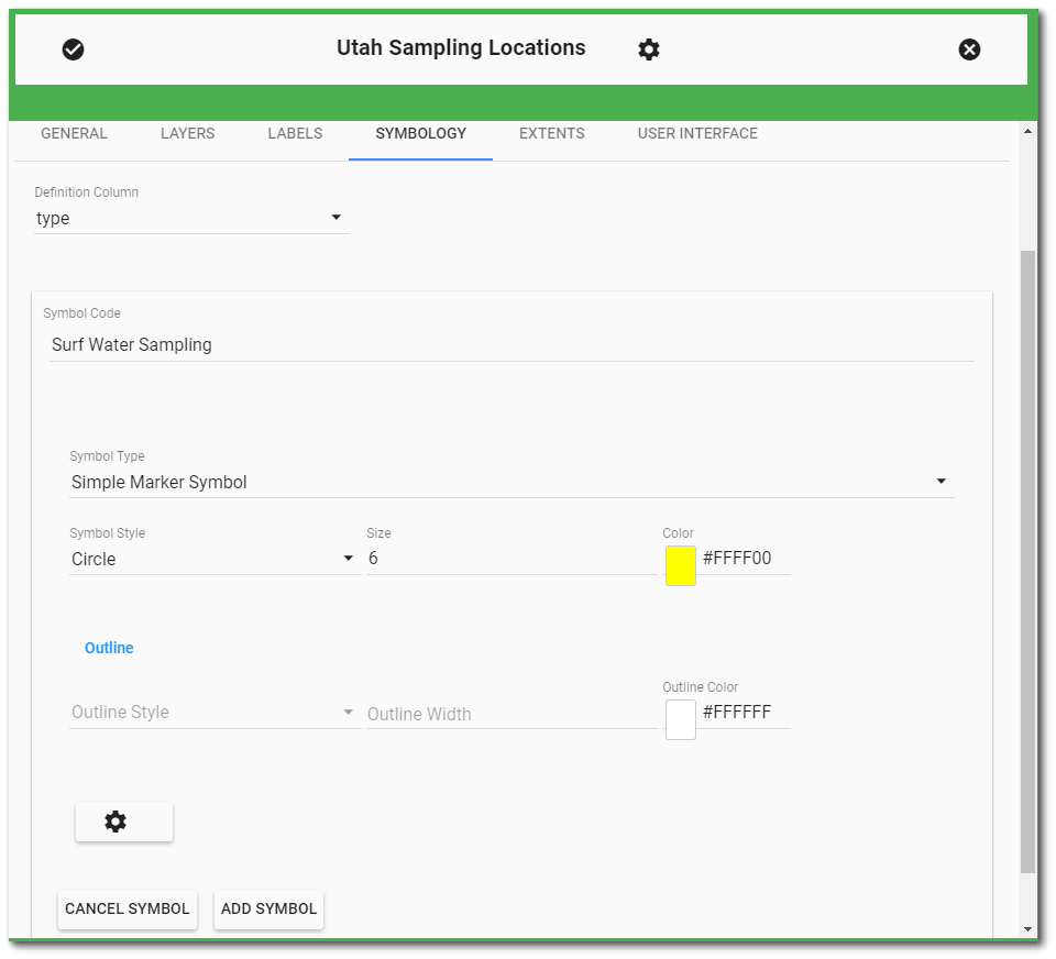
15.Select the Symbology tab. Select the desired field from the drop-down menu for the Definition Column.
For this exercise, select type (short for LOC_TYPE) as the Definition Column.
16.Click the New Symbol button to add new properties for the field selected in the Definition Column.
17.Set the properties for the new symbol as desired.
|
Note that the Symbol Code field is case sensitive and needs to be populated accordingly. For example, if the Definition Column is populated with type, the Symbol Code will need to be MONITORING WELL (not Monitoring Well) if DT_LOCATION.LOC_TYPE = MONITORING WELL. |
For this exercise, set the symbology parameters as follows and then click the Add Symbol button:
•Enter "Surf Water Sampling" for the Symbol Code. Note that this is case sensitive.
•Select Simple Marker Symbol for the Symbol Type.
•Select Circle for the Symbol Style.
•Enter "6" for the Symbol Size.
•Set the symbol Color to Yellow (#FFFF00).
18.Select the Add Symbol button to create the new symbol.
19.Select the Extents tab to set the default extent for the Map widget. The map extents can either be set from the widget layers or defined from custom extents. If the extent is set from the widget layers, the Application Default refers to the value set in ST_CONFIG and the Selected Facility refers to the defined or calculated extent of the facility configured on the General tab of the widget.
For this exercise, set the Map widget extents to Facility Layer.
20.Select Save ![]() to exit the Widget Editor and return to the map.
to exit the Widget Editor and return to the map.
21.To view a larger version of the Map, select Enter Fullscreen ![]() from the top left corner of the map widget.
from the top left corner of the map widget.
22.To exit full screen and return to the dashboard, select Exit Fullscreen ![]() from the top left corner in full screen view, hit escape on the keyboard, or hit F11 on the keyboard.
from the top left corner in full screen view, hit escape on the keyboard, or hit F11 on the keyboard.
|
Objective: Add Report Layers to a Map using the Map Widget |
Results from reports can be added as layers and configured in the Map widget. For this exercise, a previously saved analytical report will be added to the Map widget at a layer.
1.Navigate to the desired dashboard.
For this exercise, return to the "Gold King Mine - Utah <your initials>” dashboard.
2.Select More Options ![]() on the right-side of the dashboard header and then select Edit from the drop-down menu to open the Dashboard Editor. Select
on the right-side of the dashboard header and then select Edit from the drop-down menu to open the Dashboard Editor. Select ![]() to open the Widget Chooser and add a Map widget in the desired location on the dashboard. Select Save to return to the main dashboard window.
to open the Widget Chooser and add a Map widget in the desired location on the dashboard. Select Save to return to the main dashboard window.
For this exercise, do NOT add a Map widget. The already existing Utah Sampling Locations Map widget will be used.
3.Select More Options ![]() in the upper right corner of the widget to open the drop-down menu and then select the Edit menu option to open the Widget Editor.
in the upper right corner of the widget to open the drop-down menu and then select the Edit menu option to open the Widget Editor.
4.Select the Layers tab and then select Add Layer ![]() .
.
5.Select the Layer Type drop-down menu and then select User Report.
6.Select Choose a Report. The Report Chooser will open. Published reports for the selected EQuIS database can be viewed in either tiled or grid view. The title of the selected report will appear in the Choose a Report button.
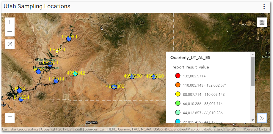
For this exercise, select the "QUARTERLY_UT_AL_<YOUR INITIALS>" report from the previous exercise. A quick way to find this report is to select the Recent folder on the Reports dashboard ribbon.
7.Select the Popup Template drop-down, and then select Attribute Listing.
8.Leave the other default properties and select the Next button to continue to define properties for the new map layer.
9.From the Renderer Type drop-down, select from the Simple, Unique Value, or Class Breaks options.
For this exercise, select Class Breaks.
10.If necessary, define the Attribute Field that will be used for the symbology. Note the Min, Max and Count will update accordingly.
For this exercise, select report_result_value.
11.Define the symbol options as needed depending on the type of symbology selected. If the Class Breaks option is selected, the number of breaks and classification scheme will need to be defined and then generated by selecting the Generate button.
For this exercise, set the classification parameters as follows and then click the Generate button to define the class breaks:
•Set Symbol Type to Simple Marker Symbol
•Set Symbol Style to Circle and set the Size to 14
•Set Classification Scheme to be Equal Interval
•Enter "7" for the Number of breaks
Seven equal classification levels will be defined. The symbology and range for each level can be edited if desired. Leave the default breaks and symbology.
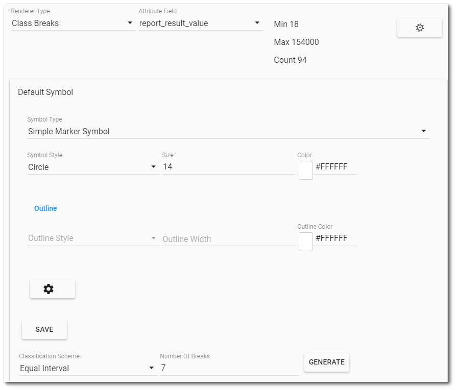
12.Select Generate to create the symbols. Edit or remove breaks as desired.
13.Select the Add Layer button.
14.Select Save ![]() to exit the Widget Editor to return to the Map widget and view the new layer. The new layer name now appears in the map Layer List and Legend.
to exit the Widget Editor to return to the Map widget and view the new layer. The new layer name now appears in the map Layer List and Legend.
For this exercise, this layer will remain on the Map widget until actively removed. The values posted on the map are the most recent results at each sampling location.