Introduction to EQuIS Enterprise
EQuIS Enterprise is part of the EQuIS environmental data management workflow. Enterprise is a web-based interface, designed for end-users, that provides advanced workflow automation for efficient and reliable data loading, quality checks, reporting, and visualization. Create highly-configurable dashboards and project-specific widgets for endless flexibility. Widgets for charts, graphs, maps, and tables are among the wide variety of options. The customizable dashboards and widgets allow for project insights to enhance and support decision making.
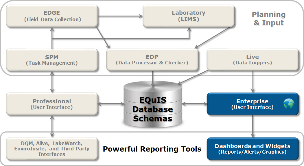
Key Terminology
Dashboards – Individual pages within an EQuIS Enterprise site that serve as containers for one or more widgets within. Dashboards can be user-defined to collate information and provide overviews (e.g., reports, charts, maps, etc.) about projects (i.e., facilities). Dashboards may contain data from one or more facilities.
Widgets – The individual elements that are added to dashboards. Widgets perform specific functions, such as the display of data or other system information. An individual widget is specific to a single facility or facility group. Multiple widgets of the same type may be added to a single dashboard. Most widgets must be configured to show specific information once added to a dashboard. Enterprise supports numerous types of widgets.
EIAs – EQuIS Information Agents can automatically email alerts and are triggered by one of the following:
•Each time new data is submitted;
•By calendar frequency (e.g., daily, weekly, monthly) or scheduled event; and
•Action level exceedances.
Permissions – EQuIS Enterprise includes a flexible and powerful permissions infrastructure to assign and manage user privileges for accessing tools and data within the application. There are four types of permissions that control how a particular user may interact with particular object types (e.g., dashboards, facilities, and reports) and individual objects (e.g., an administration dashboard, a specific facility, specific reports): Owner, Editor, Viewer, and Creator.
Enterprise Interface and Components
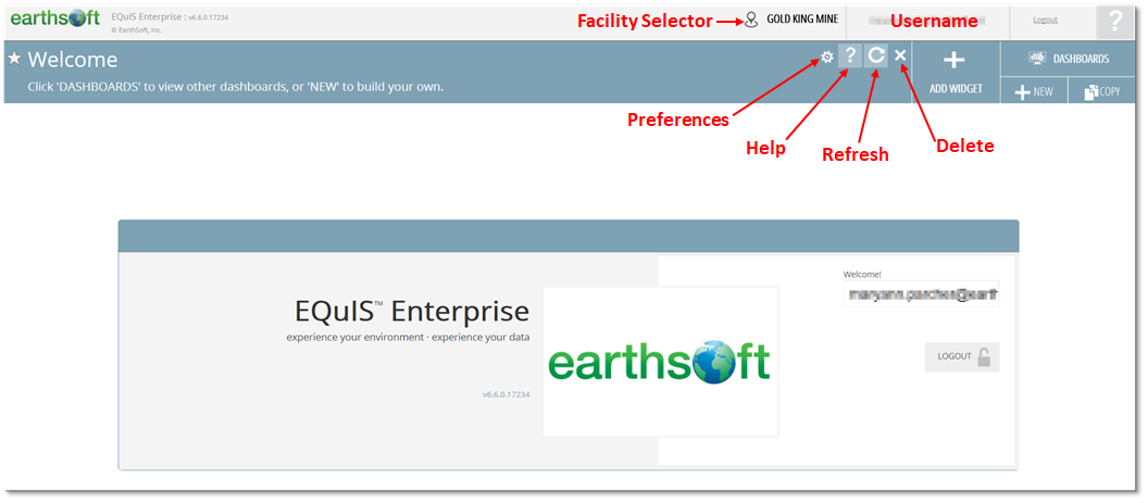
The EQuIS Enterprise interface consists of the main window ribbon and the selected dashboard. The main window ribbon displays the EQuIS Enterprise version number and username, and allows the user to select a facility, seek help, or logout. On the main banner of the selected dashboard, the title (and potentially a subtitle) will be displayed along with icons to set preferences, view documentation about the dashboard (i.e., help), refresh the dashboard, or delete the dashboard. Options to add a widget or to change dashboards are also available. These various components are illustrated on the Welcome dashboard presented in the image below.
A variety of dashboards are immediately available within EQuIS Enterprise. These dashboards can be customized and/or copied. New dashboards can also be created by users with the necessary permissions. Creation of project-specific or user-specific dashboards is recommended to provide the greatest benefit.
Customization of dashboards involves adding widgets that will convey the desired data to users and decision makers. Brief descriptions of widgets available in EQuIS Enterprise are provided below.
Data Grid Widget – Displays the output of a grid report in a sortable, filterable grid that supports paging. This widget is useful for reviewing data without downloading the full report output. This widget also supports filtering using filter widgets.
Document and Photo Browser Widget – Browse and view the metadata associated with files uploaded to Enterprise. The widget has three main sections: (1) Breadcrumbs Navigation Section, (2) Details Section and (3)Thumbnails Section. Use the breadcrumbs navigation section to browse to different folders in Enterprise. The widget will then show all the files in this folder. The details section displays the currently selected file's metadata and if the file is an image preview. The thumbnails section shows all the files in the currently selected folder and the ability to select them.
Drilldown Widget – Displays the output of a grid report as a pie chart, bar chart (horizontal bars) or column chart (vertical columns).
EDP EDD Status and Upload Widgets – Upload and view the status of EDDs that have been submitted and processed by Enterprise EDP.
EIA – Displays a list of the currently configured EQuIS information agents.
EQuIS Live Widgets – Charts data logger time series data, real time or historical.
Explorer Widget – Used for browsing, searching, and organizing items. Create folders, which can then be used to group items.
EZView Widget – Queries and downloads EQuIS reports and creates EIAs to automatically send reports. The bottom of the widget provides buttons that will run the report and then export the report data to a variety of output types (e.g., .txt, .csv, .xlsx, .shp, .kmz) for import into third party programs for additional review and/or manipulation.
Filter-Date Range Widget – Allows the selection of a parameter value and filters the report output of reporting widgets (e.g., EZView, Traffic Light, Time Series Chart, Map, Data Grid) on the dashboard. The Filter-Date Range widget filters on a specific year or on a specified date range.
Filter-List Widget – Allows the selection of a parameter value and filters the report output of reporting widgets (e.g., EZView, Traffic Light, Time Series Chart, Map, Data Grid) on the dashboard. The Filter-List widget filters on action level, analyte, analyte group, analytic method, facility, fraction, matrix, location, and task code.
HTML Widget – Displays Hyper Text Markup Language (HTML) snippets. HTML is the standard markup language for creating web pages. Therefore, text, photos, and videos can be added to an HTML widget. Other uses of the widget include adding hyperlinks to other resources or a closed circuit television feed of your facility. The HTML widget displays the content as it has been configured in the widget properties.
Map Widget – Works with Esri's ArcGIS JavaScript API to display data visually. Use the Map widget to:
•Display multi-layered map with facility locations;
•Interact directly with features on the map, such as clicking on the map to view additional information;
•Interact with other reporting widgets;
•Display report output on the map; and
•Display georeferenced documents and photographs on the map.
Notices Widget – Displays a list of notices pertaining to a user (e.g., EDD status notices, EIA notices, etc.). The notices contain the notice subject, notice date and if applicable, the facility related to the notice.
RDL Report Viewer Widget – Report Definition Language (RDL) is an XML representation of an SQL Server Reporting Services report definition, which contains data retrieval and layout information for a report. This widget interacts with RDL reports and contains Microsoft's WebForms ReportViewer control.
Role Manager Widget – Administrators use this widget to view, modify or create application roles.
RSS Reader Widget – RSS (Rich Site Summary) is a format for delivering regularly changing web content. This widget displays the RSS feed as configured in widget properties. It may take several seconds to display as the widget establishes the connection to the RSS feed.
Time Series Chart Widget – Displays report output on a Time Series Chart. The widget can display data from one or more reports and supports automatically grouping data by series, such as parameters or locations.
Traffic Light Widget – Displays good/bad summary data from a report. This widget shows report data as four states: Alert (red), Warning (yellow), OK (green), and Unknown (blue). This widget is normally used for analyte exceedances, but can be used for any other type of data by configuring the conditions for each of the breaks.
Traffic Light (Map) Widget – Displays good/bad summary data from a report, such as action levels by location, on a map. The properties for this widget are similar to those in the Traffic Light widget.
User Manager Widget – This widget is only available to administrators to view, modify, or create users.
Vertical Profile Chart Widget – Displays analytical result data with respect to depth for a given location and time. Data can come from the Basic Results and Downhole Point reports, among others.
Workflow Widget – Administrators may use this widget to view workflow status and configure workflow agents.
Training Scenario Overview
We will be working with data collected for the Gold King Mine (GKM) project site. Located approximately 10 miles north of Silverton, CO, the Gold King Mine was claimed in 1887 and was last active in the 1920s. Mining activities produced acid mine drainage that required monitoring to avoid contamination of the nearby Animas River.
In August 2015, approximately three million gallons of mine waste were accidentally released into Cement Creek, a tributary of the Animas River. The spill contained known contaminants of arsenic, cadmium, copper, lead, and aluminum. The spill changed the color of the river to orange. The post-spill monitoring includes surface water, soil and sediment to measure impact of the spill on the greater San Juan River.
We need to learn more about the Gold King Mine (GKM) project that is being managed with EQuIS. We want to use EQuIS Enterprise to visualize and understand the data for the site. To efficiently and effectively use Enterprise, it is critical to understand how to navigate and create dashboards in conjunction with how to implement a variety of widgets. An example dashboard, the Landing Page for Gold King Mine, has been created to demonstrate use of various widgets and provide ideas on how data may be easily presented to Enterprise users. On the Landing Page Dashboard, you will find the Navigation Widget with links to other Dashboards prepared to view your data.
After touring the GKM Landing Page dashboard, you will create your own GKM dashboard. During each training exercise, you will add another type of widget and configure its properties. Ideally, each training exercise in this section of the guide will be done in the order presented, as the activities build on the previous ones.
The release from GKM impacted water quality in four states: Arizona, Colorado, New Mexico and Utah. Sampling locations were grouped by state. For these training exercises, we will focus on the Utah Location Group.